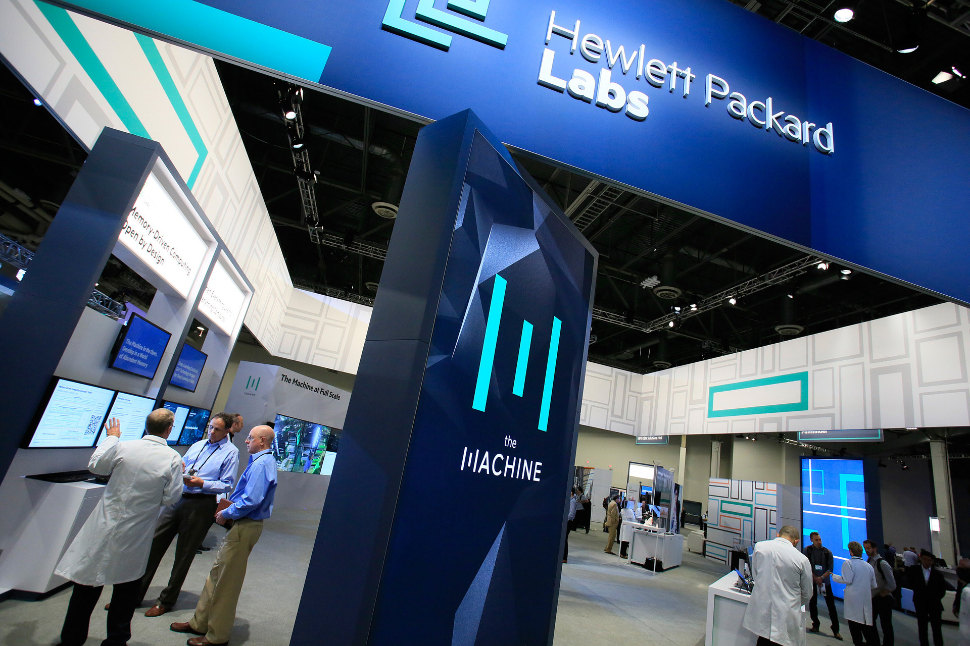
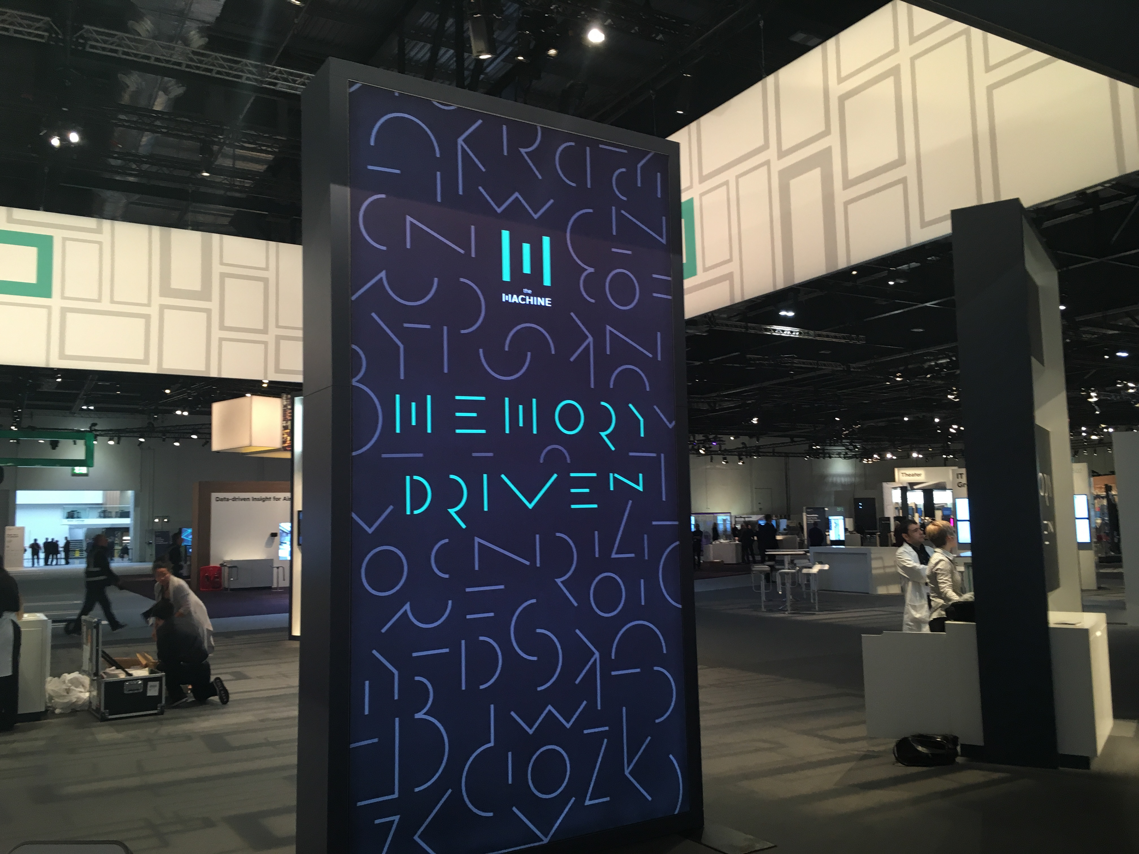
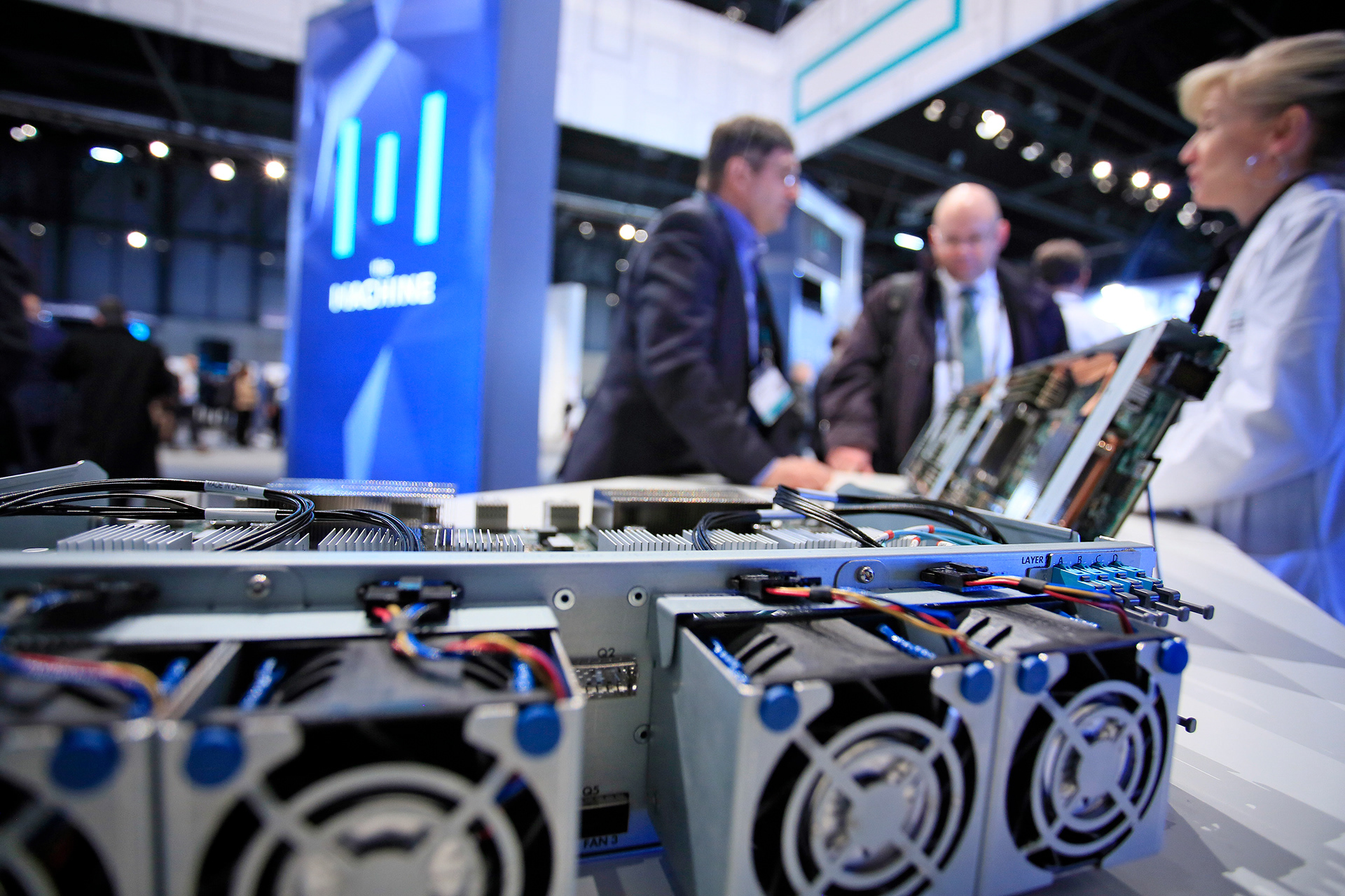
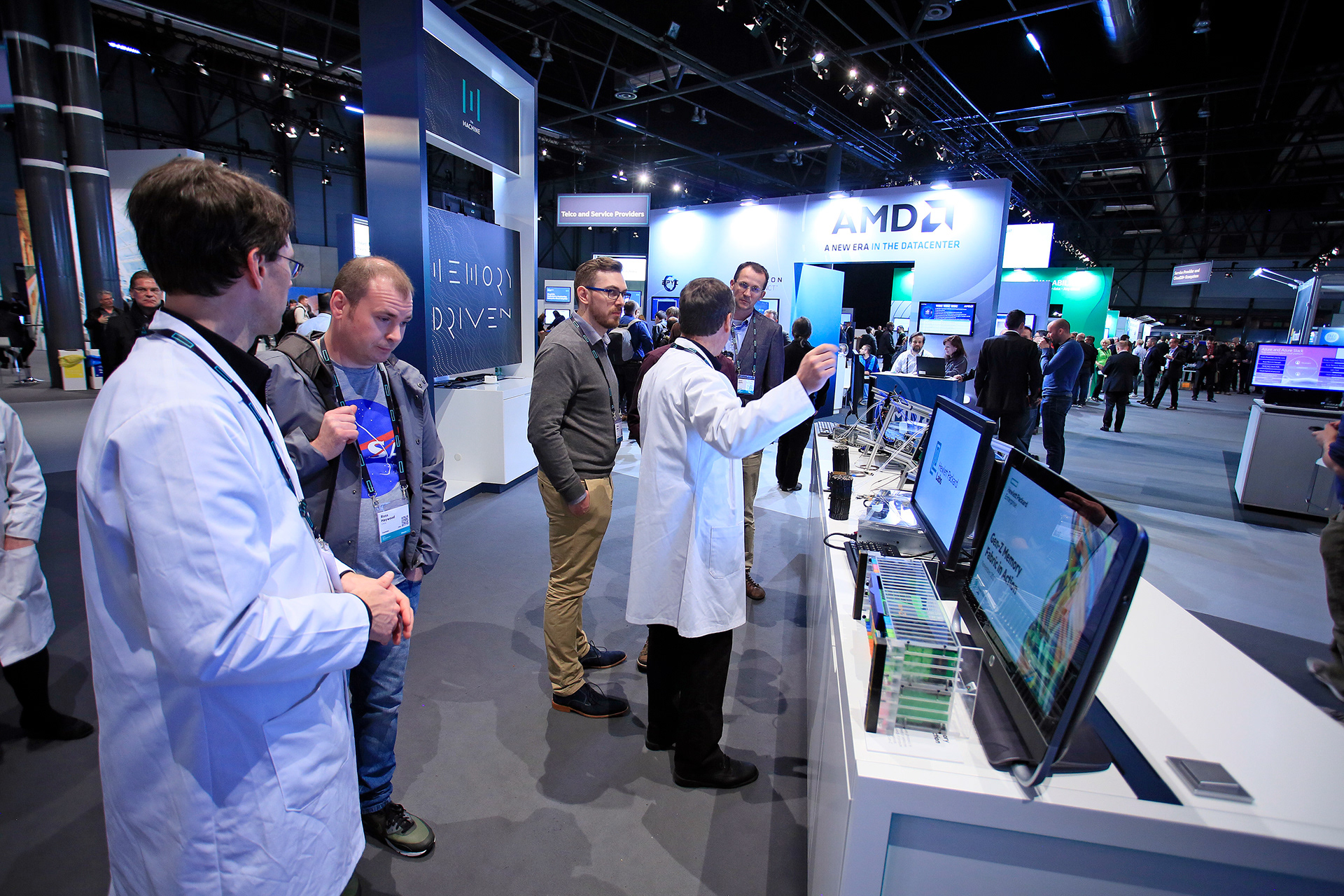
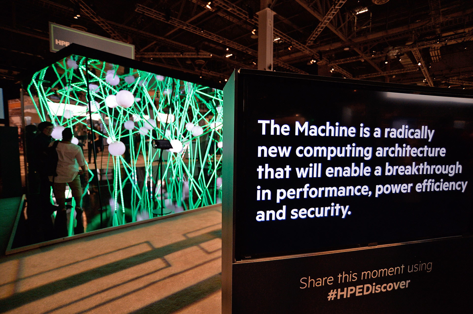
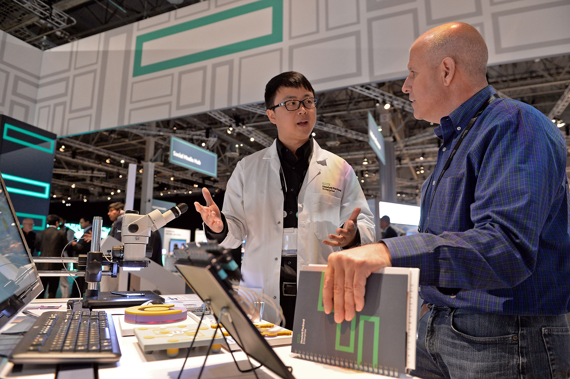
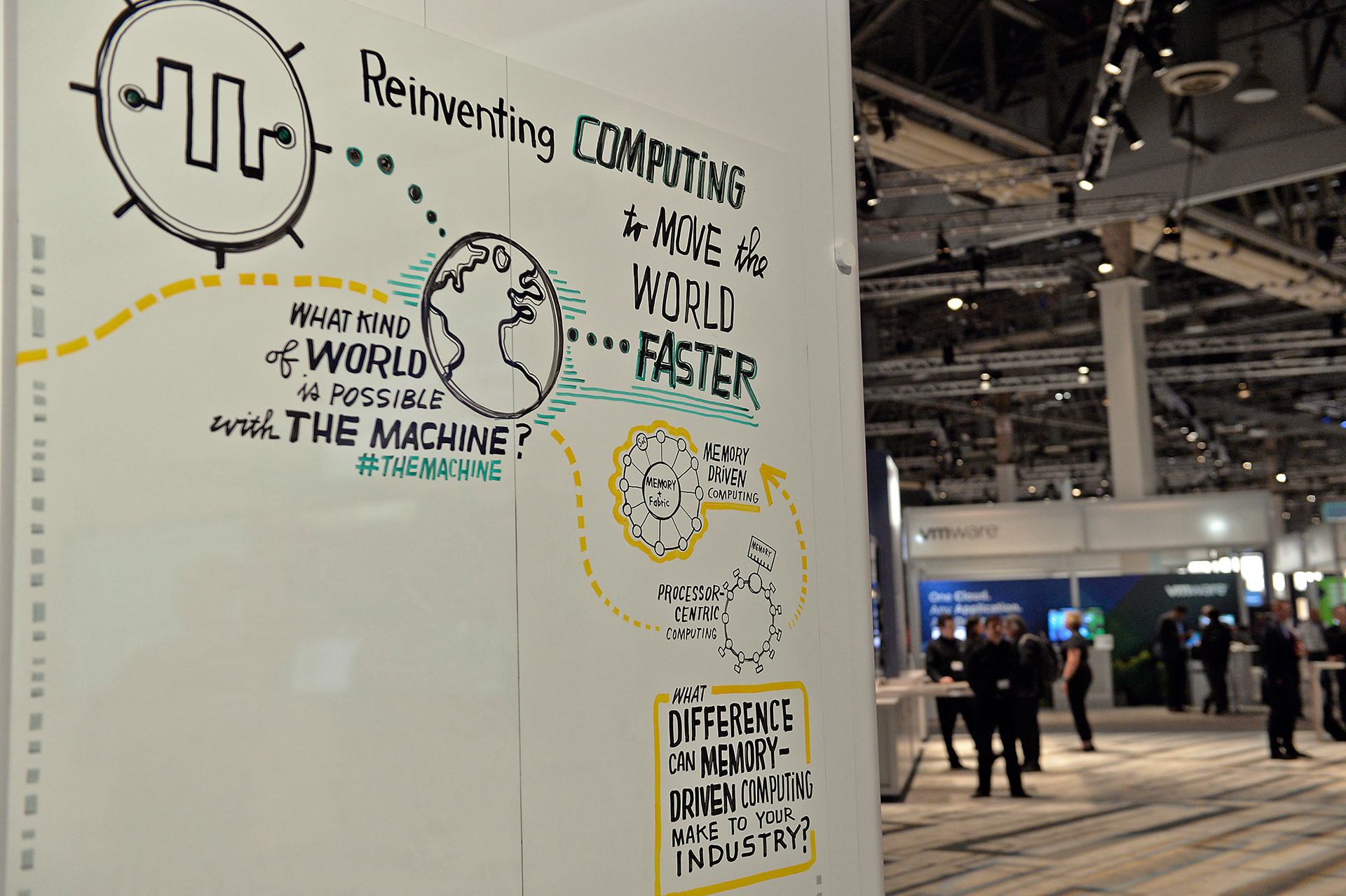
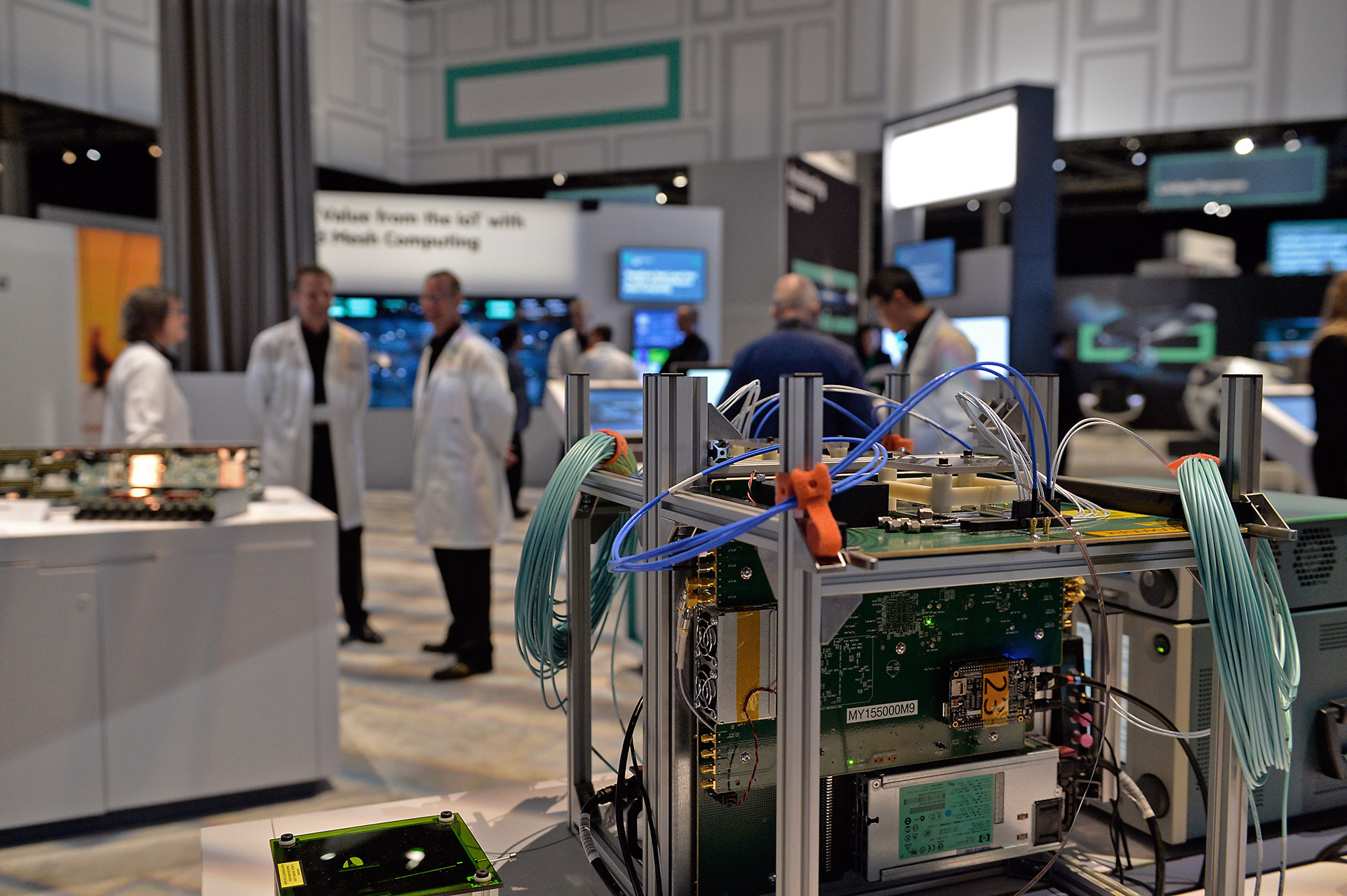
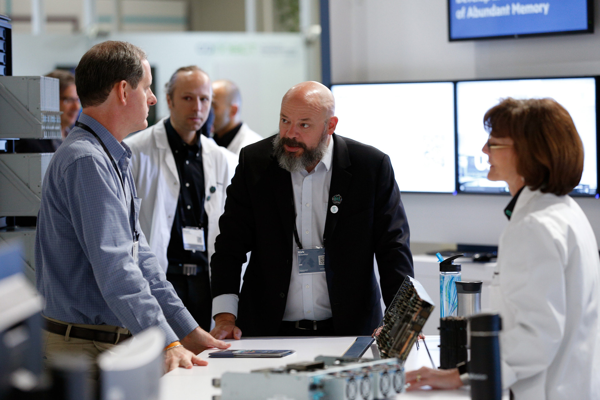
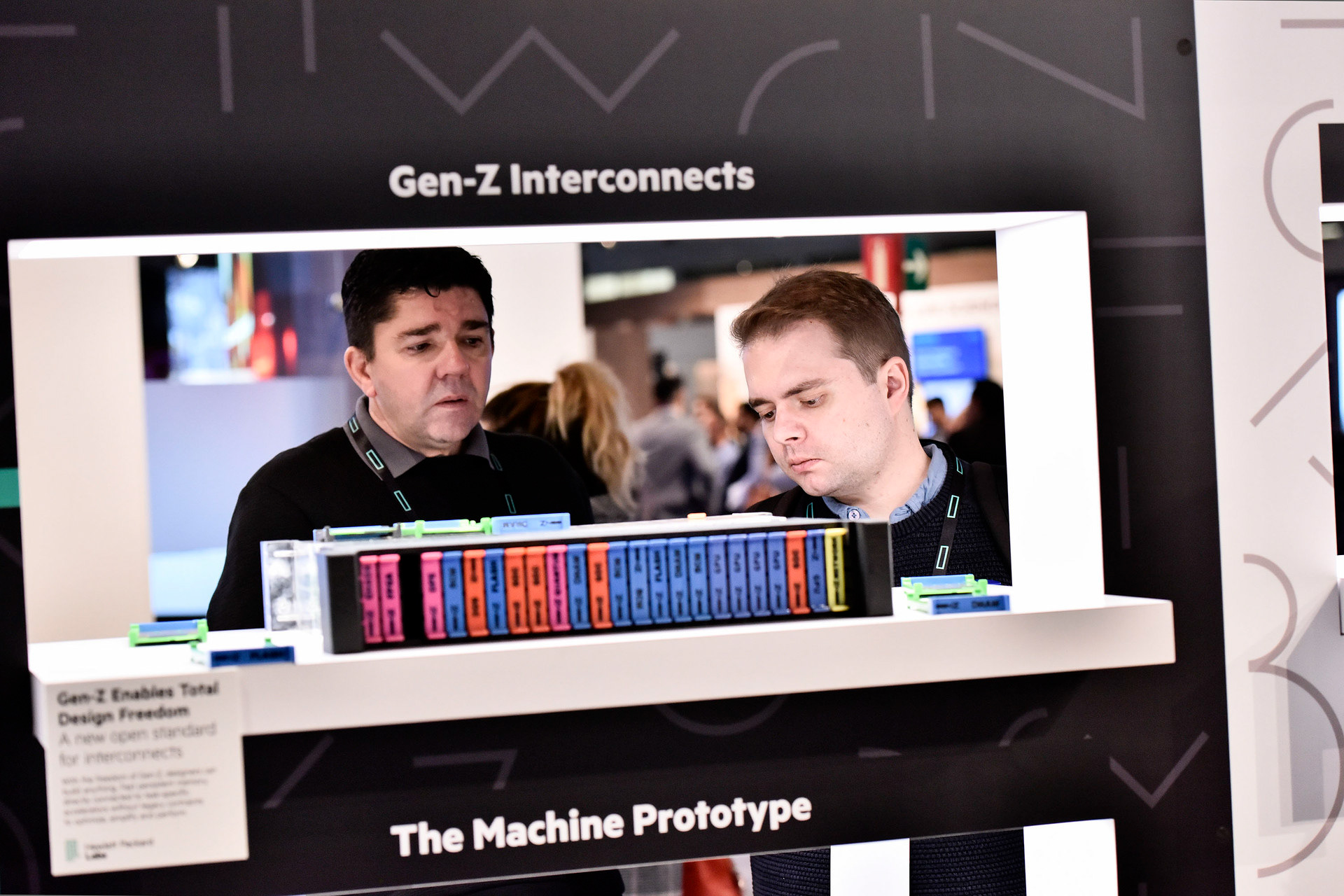
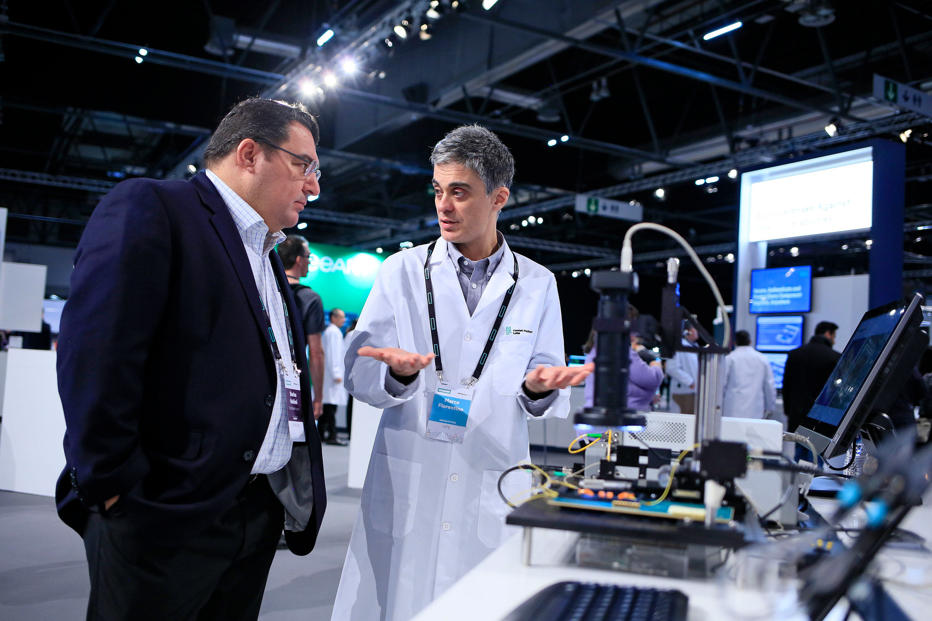
The Machine is Hewlett Packard Enterprise’s vision for the future of computing, designed to bring the promise of Memory-Driven Computing to life. Working with Hewlett Packard Labs, our agency Siegel + Gale helped craft the vision, positioning and identity for The Machine as well as a brand architecture that would support its integration into marketable products.
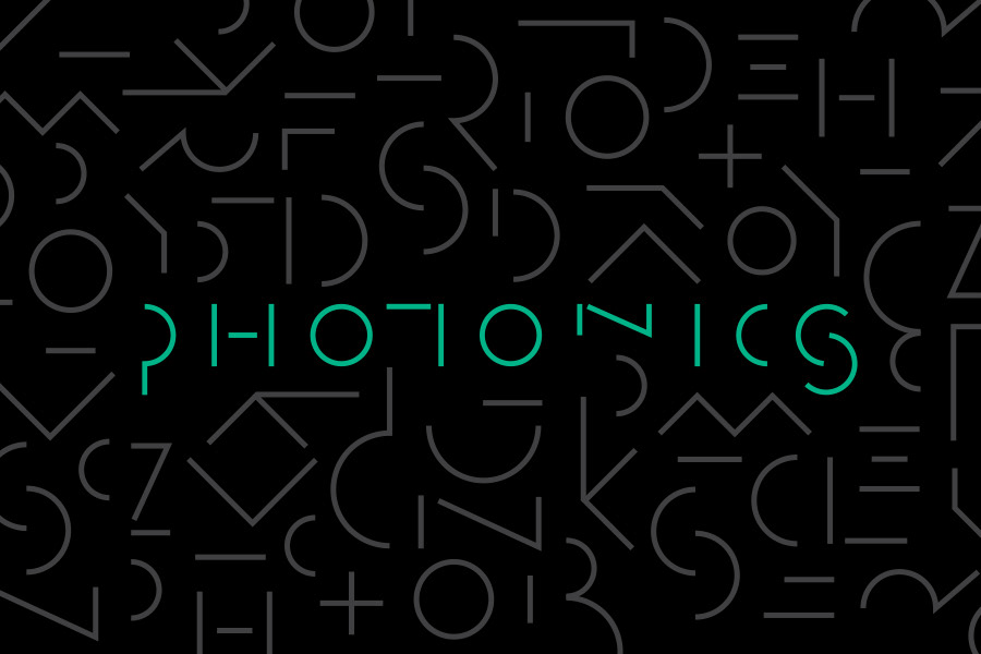
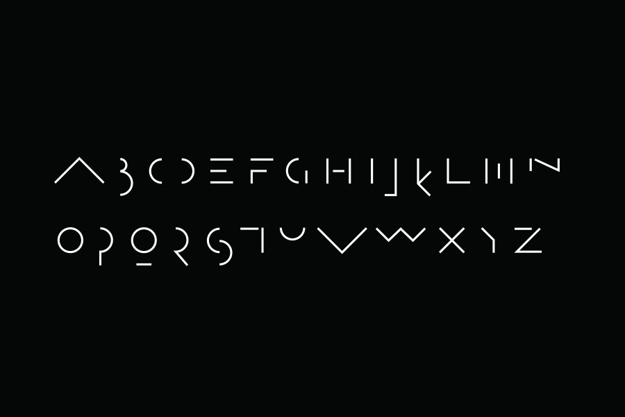
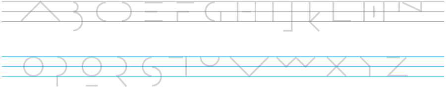
The M mark and proprietary typography created that this is a new language and way of thinking about the fundamentals of computing technology.
Both are designed to look like a futuristic, entirely new language to convey the innovative and forward-thinking nature of HPE’s technology solutions. The M Mark is a nod to HPE’s primary visual platform, “The Element.” Its rectangular form is like a frame to create a point of focus and a window on partnership. The Machine’s visual identity is indicative of HPE’s commitment to remain agile, decisive and fast in an ever-changing world.